Branding design
Seafox – This client approached us wanting a branding designed for an umbrella company. A generic logo, housing a variety of businesses under one company.
The Brief – Professional, clean and stylish with a modern feel with cool colours and sweeping movement like the sea. White is good, colours not too bright and pink is out of the question. No heavy fonts for the logo if possible.
Strong branding
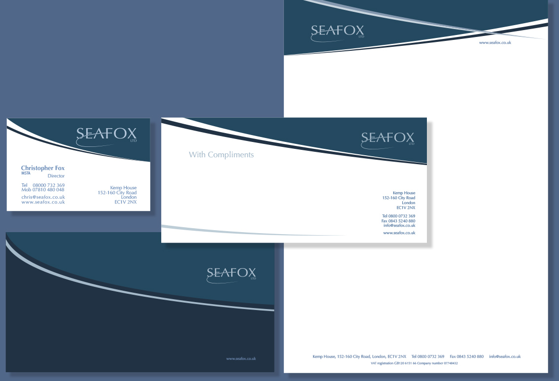
First of all we created his corporate stationery and full corporate branding including a logo. We designed the branding in a way that would look good for a long time because the colours used are not too bright. Calming blue and sweeping lines making way for clean white space while remaining a timeless design cool and contemporary.
Stationery design and branding
The dark blue hues look very smart against the large white spaces on the letterhead, complimentary slip and business card. The overall feel is that of a professional, medium to large sized company. Colour is key while totally original design elements enhance the overall branding. A well considered brand that stands up well to changing trends.
Our client was impressed throughout the design process. We were also excited to see the final results and are proud to have the designs in our portfolio of work. This typeface has a slight hint of a serif which is very slick and easy on the eye. Once the logo was done the rest of the stationery emerged relatively quickly, to our clients delight.
Affordable branding
In conclusion it cost much less than he expected and as a result he was over the moon. He loved the logo, in addition it was the first time he had a professional logo designed. Especially relevant he has finally found a good graphic designer that gets the design right every time. He has had very positive feedback from his clients and friends and consequently can’t wait to start the next project.
They have been our clients since 2008.


