Logo design
Stockwood Osteopaths – This client has a very well known local Osteopath. A professional logo was probably top priority because without that the rest of the projects would not be as good as they should be. Stockwood Osteopathic & Sports Injury Clinic is a private osteopathic practice that provide a complete range of diagnostic and treatment skills. Highly respected in his field consequently his company image needed to be excellent and his branding on point.
The Brief – Medical, clean, stylish and professional branding that can be carried through to all aspects of marketing and printed medical literature. This would include leaflets, appointment cards and posters. A company image that implies target pain relief and treatment rather than just pain in clinical colours. A look that will last for years to come so therefore easy to read, clean and crisp.
Corporate identity branding logo
First of all the logo needed to show target pain while remaining clinical and contemporary. This was not an easy task. Most of all the look had to carry into the website and still look good. Therefore using blue and white kept it clean and professional. A medical feel with an image of a back and most noteworthy, the spine that implies target pain relief for the back. The branding uses the spinal concept within a human form, keeping the look consistent.
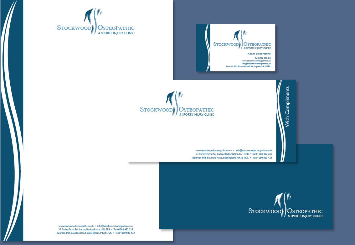
Logo and stationery
In conclusion, we have created a logo, printed literature and probably most noteworthy their corporate stationery.
He was amazed at the level of design quality and detail that went into his corporate branding. His clients have also loved the designs and especially relevant, the logo. I have to say we really enjoyed working on these elements so it seems like we created them yesterday. Seems like the branding has stood the test of time.
They have been our clients since 2006.


